#Sliding Div When Scroll Down Page Using Jquery
Explore tagged Tumblr posts
Visit Tumblr Blog
Explore Tumblr blogs with no restrictions, modern design and the best experience.
Last Seen Tumblr Blogs


Fun Fact
69% of Tumblr users are millennials.
Photo
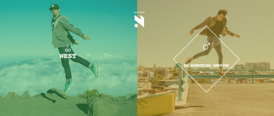
Tutorial: Creative Spitscreen Layout with CSS3 Animations (Pt. 2)
A few weeks ago, I demonstrated how to build a split-screen website layout using CSS flexbox and viewport units that offers an alternative way to present a brand’s featured content. Clicking on one side or the other navigates further into the site without a page load, using CSS transitions and 3d transforms. This week, I’ll show you how to use these same techniques to add animation and movement to the content and buttons.
Check out Part 1
See the Pen CSS Responsive Full Screen Duo Layout With Animated Overlay by Markus Sladek (@SDesignerMagazine) on CodePen.
Structure If you followed along for part one, you should already have created the overlay, or wrapper for your content and added a jQuery snippet to animate its entrance using Animate.css classes. Here is a refresher on which pieces we start with, using the left or west side as an example:
<div id="west-overlay" class="overlay"> content goes here </div>
$("#west .content").click( function() { $("#west-overlay").addClass("animated fadeInLeft open").one('webkitAnimationEnd mozAnimationEnd MSAnimationEnd oanimationend animationend', function(){ $(this).removeClass("animated fadeInLeft"); }); });
In keeping with the two-column style of the design, this page will also use flexbox to create a single column within which the content can be layed out:
<div id="west-overlay" class="overlay"> <div class="grid"> <div class="column"> <img src="photo-url"/> </div> <div class="column"> <div class="product-content"> <h1>Rainbow Chasers</h1> <p>...</p> <div class="price"> <span class="currency">$</span> <span class="amount">89.99</span> </div> <a href="#" class="buy-button"><span>Buy Me</span></a> <div class="size-guide-link underline-link">Size guide</div> </div> </div> </div><!--End Grid--> <div class="close-icon"> <div></div> <div></div> </div></div> </div>
Within the overlay, we have created a grid wrapper to hold our flex items, starting with two columns. The left column holds an image, and the right column holds our page content, which in this case is a heading, description, price and call to action for a featured product. Spans are used to allow us to style specific text elements separately without affecting how the text naturally sits in its parent element.
Finally, a close-icon is created in pure CSS and placed within the main overlay, consisting of one main div and two inner divs to create the X.
Styling
The existing grid rule used for our main layout is applied to setup our flexbox.
.grid { position: relative; width: 100vw; height: 100vh; display: flex; flex-direction: row; flex-wrap: wrap; }
To vertically center the content responsively, we will use table. This could also be done with flexbox inception, but table is much simpler. Learn more about vertical centering here.
.overlay .column{ display: table; height: 100%; } .product-content{ font-size: 1.4rem; padding: 10%; display: table-cell; vertical-align: middle; }
Animating the Content
This demo makes use of two kinds of animation – the static kind gained through transitions, and the more complex kind using keyframes. In the case of transitions, you select the property you want to transition, which can be anything from a background gradient to a transform. For animations, you select the keyframe block. The magic happens once you declare the duration length for the animation or transition.
The transition timing function is what controls the values of intermediate states between the start and end declarations. It’s optional, and defaults to ease. When dealing with simple animations and transitions, you’ve probably used ease-in-out to make link hovers, buttons and other simple movements appear more graceful, but transition is not enough to move an element along a path on a specified timeline, allowing it to change in multiple ways. That is where CSS animation is useful.
When the diamond area of our layout, selected with #west .content is clicked, our content div with the ID of #west-overlay will get three new classes: animated, fadeInLeft and open. When the animation ends, the animation classes will be removed.
The open class makes the div visible and adds a transition effect.
The animated class, provided by Animate.css, sets up the animation duration and primary rules for the movement.
The fadeInLeft class, provided by Animate.css, fades in the div and moves it into position from the left.
You can change the animation type by replacing fadeInLeft with any of the available animations in Animate.css, or with your own animation name. Here is a look at what fadeInLeft looks like using CSS animation keyframes:
@keyframes fadeInLeft { from { opacity: 0; transform: translate3d(-100%, 0, 0); } to { opacity: 1; transform: none; } } .fadeInLeft { animation-name: fadeInLeft; }
Pretty simple, right? Over a default animation-duration of one second, the overlay div will fade in and be moved into position.
The content of the overlay can be animated in the same way, using an endless combination of styles. Create another jQuery statement inside the click function for the #west .content selector:
$("#west-overlay .product-content").addClass("animated flipInY ").one('webkitAnimationEnd mozAnimationEnd MSAnimationEnd oanimationend animationend', function(){ $(this).removeClass("animated flipInY"); });
Delays and Duration
So when the diamond area is clicked, both the overlay animation and the content animation are kicked off. If you wanted your content to begin animating only after the overlay does, you would tuck it into the one function instead, just after $(this).removeClass("animated fadeInLeft");
Using what you’ve learned about using these functions, you can select any part of your content to animate it separately, such as fading in the image, sliding down the heading and then flipping in the button, for example. To add a delay for the animations, or make the animation slower or faster, the following properties can be added to your CSS rules for the element you are adding the animation class to:
.product-content { animation-duration: 3s; animation-delay: 2s; }
As you can see, the visual effects are achieved through transitions and transforms, whereas movement along a path is achieved through the additional use of CSS animation. In the next section, we’ll look at the static effects used to add more interest and life to the interactions on the page, meant to entertain our visitors and keep them more engaged.
Interactions
To get the layered look of the button, we use styling of pseudo-elements ::before and ::after, and a span for the button text so we can position it properly when the button is pressed.
A transition is added to the span to give the transform we will add on hover a smooth animation.
.buy-button{ height: 50px; width: 100%; margin: 2rem 0; position: relative; background: #eee; border: 3px solid #f9efb2; } .buy-button > span { display: block; position: relative; font-weight: 700; font-size: 1rem; text-transform: uppercase; color: #1f1f22; transition: opacity 0.35s, transform 0.35s; z-index: 10; line-height: 60px; }
The pseudo-elements are given a border and transition to match the above. They are offset using absolute positioning and sent behind our span using z-index to give the button some dimension.
.buy-button:after, .buy-button:before { content: ''; position: absolute; top: 0; left: 0; border: 3px solid #f9efb2; transition: opacity 0.35s, transform 0.35s, ease-in-out .3s; } .buy-button:before { background: #FFF; margin: 0px 0 0 0px; top: 5px; left: 5px; width: calc(100% + 2px); height: calc(100% + 2px); z-index: 1; }
The hover effect is created using translate3d to move the top face of the button a few pixels backwards. Simple!
.buy-button:hover span, .buy-button:hover:before { transform: translate3d(-4px, -4px, 0px); }
Link Underline
Next we have a subtle "animated" underline on our Size Guide link. The line is created using a pseudo-element:
.underline-link::before { content: ''; position: absolute; bottom: 0; left: 0; width: 100%; height: 1px; background: #202023; transform-origin: left; transform: scaleX(0); transition: transform .2s ease-in-out; }
The transform-origin: left declaration draws the line from the left. Remove this if you want it to grow from the center. The transform: scaleX(0) declaration establishes the starting point as 0 which we will grow to 1 on hover, and a basic ease-in-out transition is added to the transform to create a smooth "animated" look when we change its value on hover:
.underline-link.active::before, .underline-link.hovered::before, .underline-link:hover::before { transform: scaleX(1); }
Close Button
Going back to transition timing functions like ease and linear, you may have noticed that they are somewhat limited. If you want more control over the speed of the effect as it is played out, the cubic-bezier property does the trick. To put it simply, cubic-bezier allows your transition to play out along a bezier curve rather than a straight line, allowing for 4 points of control rather than two. This can be used to create more dimensional effects, or in the case of our Close Button, to give each "leg" of our X the appearance of separate animations while only applying the effect to two divs.
.close-icon div { display: block; height: 3px; position: relative; transition: transform 0.6s cubic-bezier(0.19, 1, 0.22, 1) 0s, opacity 0.4s cubic-bezier(0.19, 1, 0.22, 1) 0s; width: 36px; }
The button itself is created from our two inner divs and the ::before and ::after pseudo-elements, formed into an X using translate3d transforms.
.close-icon div::after, .close-icon div::before { content: ""; display: block; height: 100%; pointer-events: none; position: absolute; width: 100%; } .close-icon div::before { background: none repeat scroll 0 0 #34d5cf; opacity: 1; transform: translate3d(0px, 0px, 0px); } .close-icon div::after { background: none repeat scroll 0 0 #ead918; opacity: 0; transform: translate3d(100%, 0px, 0px); } .close-icon div:first-child { transform: translate3d(0px, 10px, 0px) rotate3d(0, 0, 1, -45deg); } .close-icon div:first-child::after, .close-icon div:first-child::before { transition: transform 0.6s cubic-bezier(0.19, 1, 0.22, 1) 0s, opacity 0.2s cubic-bezier(0.19, 1, 0.22, 1) 0s; } .close-icon div:last-child { transform: translate3d(0px, 8px, 0px) rotate3d(0, 0, 1, 45deg); } .close-icon div:last-child::after, .close-icon div:last-child::before { transition: transform 0.6s cubic-bezier(0.19, 1, 0.22, 1) 0.2s, opacity 0.2s cubic-bezier(0.19, 1, 0.22, 1) 0.18s; } .close-icon:hover div::before { opacity: 0; transform: translate3d(-100%, 0px, 0px); } .close-icon:hover div::after { opacity: 1; transform: translate3d(0px, 0px, 0px); }
A cubic-bezier transition is then added to the opacity and transform to get the effect of each "leg" flying in or out when changed on hover:
.close-icon:hover div::before { opacity: 0; transform: translate3d(-100%, 0px, 0px); } .close-icon:hover div::after { opacity: 1; transform: translate3d(0px, 0px, 0px); }
Finally, we need to add one last jQuery function to animate and hide the overlay when it is closed by clicking on our close button.
$("#west-overlay .close-icon").click( function() { $("#west-overlay").addClass("animated flipOutY ").one('webkitAnimationEnd mozAnimationEnd MSAnimationEnd oanimationend animationend', function(){ $(this).removeClass("animated flipOutY open"); }); });
Here we add the Animate.css class animated and our chosen animation class, detect when the animation ends with one, then remove the animation classes as well as the open class to hide the overlay and bring us back to our main layout.
Resources:
CSS Transitions
CSS Animation
Animate.css
scale()
translate3d()
transform-origin
cubic-bezier() helper
Full Screen Demo
Download File
1 note
·
View note
Link
SitePoint
When adding a navigation menu to a webpage, there are a lot of things to take into consideration. For example where to position it, how to style it, how to make it responsive. Or maybe you want to add some kind of animation to it (tastefully, of course). At this point you might be tempted to grab a jQuery plugin which does most of that for you. But that needn’t be! It’s actually pretty simple to create your own solution in a few lines of code.
In this post, I will demonstrate how to create an animated, sticky navigation menu with vanilla JavaScript, CSS and HTML. The final product will slide up out of your way as you scroll down the page, then slide back into view (with a stylish see-through effect) when you scroll back up. This is a technique used by such popular sites, such as Medium and Hacker Noon.
After reading you’ll be able to employ this technique in your own designs, hopefully to great effect. There’s a demo at the end of the article for the impatient.
Sticky Navigation Menu: Basic HTML Structure
The following is the skeleton HTML code that we will be working with. Nothing too exciting going on here.
<div class="container"> <div class="banner-wrapper"> <div class="banner"> <div class="top"> <!-- Navbar top row--> </div> <div class="nav"> <!-- Links for navigation--> </div> </div> </div> <div class="content"> <!-- Awesome content here --> </div> </div>
Applying a Little Styling
Let’s add some styling to the main elements.
Main Container
We’ll need to remove any inherent browser styles and set the width of our container to 100%.
*{ box-sizing:border-box; padding: 0; margin: 0; } .container{ width: 100%; }
Banner Container
This is a wrapper around the navigation menu. It is always sticky and slides to hide or reveal the navigation menu as you scroll your page vertically. We are giving it a z-index value to ensure that it appears on top of the content.
.banner-wrapper { z-index: 4; transition: all 300ms ease-in-out; position: fixed; width: 100%; }
Banner Section
This contains the navigation menu. Changes in position and background color are animated through the CSS transition property when a page is scrolled up or down.
.banner { height: 77px; display: flex; flex-direction: column; justify-content: space-around; background: rgba(162, 197, 35, 1); transition: all 300ms ease-in-out; }
Content Section
This section will contain a background image and text. We will add a parallax effect to this part of the page in a later section of the article.
.content { background: url(http://j.mp/2rvcLoi) center no-repeat; background-size: cover; padding-top: 100%; }
Animating the Menu
The first thing we need to do is to attach an event handler to the scroll event, so that we can show and hide the menu accordingly when the user scrolls. We’ll also enclose everything in an IIFE so as to avoid clashes with other code running on the same page.
(() => { 'use strict'; const handler = () => { //DOM manipulation code here }; window.addEventListener('scroll', handler, false); })();
Setting Some Initial Values
We’ll be using a refOffset variable to represent the amount of distance the user has scrolled down the page. This is initialized to 0 on page load. We’ll use a bannerHeight variable to store the menu’s height and will also need references to the .banner-wrapper and .banner DOM elements.
let refOffset = 0; let visible = true; const bannerHeight = 77; const bannerWrapper = document.querySelector('.banner-wrapper'); const banner = document.querySelector('.banner');
Next we need to establish scroll direction so that we can show or hide the menu accordingly.
We’ll start off with a variable called newOffset. On page load this will be set to the value of window.scrollY — the number of pixels that the document is currently scrolled vertically (so 0 initially). When a user scrolls, newOffset will increase or decrease accordingly. If it is greater than the value stored in bannerHeight then we know our menu has been scrolled out of view.
const newOffset = window.scrollY; if (newOffset > bannerHeight) { // Menu out of view } else { // Menu in view }
Scrolling down will make newOffset greater than refOffset and the navigation menu should slide up and disappear. Scrolling up will make newOffset less than refOffset and the navigation menu should slide back into view with a see through effect. After performing this comparison, we will need update refOffset with the value of newOffset to keep track of how far the user has scrolled.
if (newOffset > bannerHeight) { // Menu out of view if(newOffset > refOffset) { // Hide the menu } else if (newOffset < refOffset) { // Slide menu back down } refOffset = newOffset; } else { // Menu in view }
Animating the Menu
Finally, let’s add an animateIn and an animateOut method to show and hide the menu. We should also make sure that the see-through effect is removed from the menu once the top of page is reached.
if (newOffset > bannerHeight) { if (newOffset > refOffset) { animateOut(); } else { animateIn(); } refOffset = newOffset; } else { banner.style.backgroundColor = 'rgba(162, 197, 35, 1)'; }
And here are the functions that do the animation.
function animateOut() { bannerWrapper.style.transform = `translateY(-${bannerHeight}px)`; bannerWrapper.style.msTransform = `translateY(-${bannerHeight}px)`; bannerWrapper.style.webkitTransform = `translateY(-${bannerHeight}px)`; bannerWrapper.style.MozTransform = `translateY(-${bannerHeight}px)`; banner.style.background = 'rgba(162, 197, 35, 0.6)'; } function animateIn() { bannerWrapper.style.transform = 'translateY(0px)'; bannerWrapper.style.msTransform = 'translateY(0px)'; bannerWrapper.style.webkitTransform = 'translateY(0px)'; bannerWrapper.style.MozTransform = 'translateY(0px)'; banner.style.background = 'rgba(162, 197, 35, 0.6)'; }
You might want to consider using a CSS class for this, which you could remove and apply accordingly. In this case however, I have gone with the JavaScript version.
Demo
Here is a demo of the working menu.
See the Pen ZKJVdw by SitePoint (@SitePoint) on CodePen.
Conclusion
This article has described how you can design an animated navigation menu in a few lines of code using just vanilla JavaScript — no jQuery needed. The menu slides to disappear when you scroll down and slides back into view with a transparency effect when you scroll back up. This is done by monitoring the vertical scroll direction and applying CSS transformations to the DOM element as required. Such a custom solution gives you more freedom to easily and flexibly design according to your own requirements and specifications.
This article was peer reviewed by Vildan Softic. Thanks to all of SitePoint’s peer reviewers for making SitePoint content the best it can be!
http://j.mp/2rv0UXE via SitePoint URL : http://j.mp/2c7PqoM
0 notes
Text
80% off #Projects in CSS – $10
Learn Professional CSS Development Techniques Building Projects
All Levels, – 10 hours, 54 lectures
Average rating 4.3/5 (4.3 (176 ratings) Instead of using a simple lifetime average, Udemy calculates a course’s star rating by considering a number of different factors such as the number of ratings, the age of ratings, and the likelihood of fraudulent ratings.)
Course requirements:
Basic Knowledge of HTML and CSS
Course description:
Be the front end wizard with this unique course from Eduonix. We bring together a curriculum where you will learn all the tips and tricks of CSS and HTML design while building ten awesome projects. It will help you master different aspects of front end programming and will show you all the best development practices. The following projects have been specially selected to be part of this course.
Project 1 – Landing Page Design
Description: We will create an HTML5/CSS landing page which will feature a header & footer, a list with image bullet points, an HTML5 form and a testimonial block. The page will be completely responsive and will adapt to any screen size by using CSS3 media queries. We will be using the Eric Meyers reset file as well.
Features/Technologies: HTML5, CSS3, Web Forms, Lists, Reset Files, Responsive Web Design
Project 2 – Responsive Tableless Calendar
Description: We will create a web calendar page using HTML5/CSS. Unlike many calendars which use HTML tables for positioning and presentation, our calendar will use only CSS. The calendar will be completley responsive and will have a sub-layout for smaller screen sizes.
Features/Technologies: HTML5, CSS3, Lists, Responsive Web Design, Table-like layout using CSS only, Box Spacing, Padding & Margins
Project 3 – Pure CSS Image Slider
Description: Most image sliders that you see around the Web are powered by JavaScript or a JavaScript library like JQuery. We will build a fully functional image slider with pure CSS. We will have thumbnails which when clicked, make the bigger image slide into place. We will use CSS animation/keyframes to achieve this.
Features/Technologies: HTML5, CSS3, Animation, Keyframes, z-index & Positioning
Project 4 – Transition Drop Down Menu
Description: We will build a multi-level dropdown menu using CSS transitions for the dropdown animation effect. We will use just a bit of JQuery to dynamically add a div element
Features/Technologies: HTML5, CSS3, Nested Lists, Responsive Web Design, CSS Transitions, JQuery
Project 5 – CSS Timeline
Description: In this project we will build a timeline using HTML5/CSS. This project will steer away from the common box-like layouts we see all the time. There will be points for years and events with descriptions. This could be used for many things such as professional/employment and personal/lifestyle tracking.
Features/Technologies: HTML5, CSS3, Responsive Web Design, Fluid Layout, Background Images & Positioning
Project 6 – Tables with SASS
Description: SASS is a CSS pre-processor that allows us to do great things like use variables, mixins and nested styles. We will create some pricing tables for web hosting packages
Features/Technologies: HTML5, CSS3, Lists, Responsive Web Design, Fluid Layout, Installing, Configuring & Working With SASS
Project 7 – CSS Image Gallery
Description: We will build an image gallery with the help of JQuery. The layout will be styled with CSS and we will use JQuery for dynamic category filtering and image lightbox. We will also create a very simple logo in Photoshop
Features/Technologies: HTML5, CSS3, Responsive Web Design, Fluid Layout, JQuery, JQuery Fancybox Plugin
Project 8 – Animated Car
Description: We will focus on CSS3 animation and keyframes to position and animate images. We will use an image of a car and make it appear to be driving down the street
Features/Technologies: HTML5, CSS3, Animation, Keyframes, Image Slicing in Photoshop, Background Images & Positioning
Project 9 – Animated Bootstrap Template
Description: Twitter Bootstrap is the most popular HTML5/CSS framework available. We will be building a custom Bootstrap template along with some animation including scroll initialized animation using JQuery and CSS
Features/Technologies: HTML5, CSS3, Animation, Keyframes, Twitter Bootstrap, JQuery
Project 10 – NewsLetter Design with LESS
Description: LESS is another CSS pre-processor
Reviews:
“I really enjoyed learning Web skill as the instructor is tremendous” (Mr Noor ali Bayat)
“For me as PHP developer with basic knowledge of CSS this course has enormous value added. However, the last section (Less) is a little bit misleading. There is not DRY principle followed in all cases. In general it is like creating css, but instead od css file extension just put less extension.” (Jan Stancek)
“A good course I’d say if you got some basic knowledge of CSS and you are looking to improve your knowledge in CSS. The instructor explains pretty much everything, and you got enough time to code along with him. Overall it’s a pretty good course.” (Liav Avnaim)
About Instructor:
Eduonix Learning Soultions Eduonix-Tech . Eduonix Support
Eduonix creates and distributes high quality technology training content. Our team of industry professionals have been training manpower for more than a decade. We aim to teach technology the way it is used in industry and professional world. We have professional team of trainers for technologies ranging from Mobility, Web to Enterprise and Database and Server Administration.
Instructor Other Courses:
Linux For Absolute Beginners Eduonix Learning Soultions, 1+ Million Students Worldwide | 200+ Courses (22) $10 $30 Projects In ReactJS – The Complete React Learning Course Eduonix Learning Soultions, 1+ Million Students Worldwide | 200+ Courses (16) $10 $40 Implementing and Managing Hyper-V in Windows Server 2016 Eduonix Learning Soultions, 1+ Million Students Worldwide | 200+ Courses (1) $10 $20 Become An AWS Certified Solutions Architect – Associate Learn to build an Auth0 App using Angular 2 Youtube: Beginners Guide To A Successful Channel The Developers Guide to Python 3 Programming Learn To Build A Google Map App Using Angular 2 Learn Web Development Using VueJS …………………………………………………………… Eduonix Learning Soultions Eduonix-Tech . Eduonix Support coupons Development course coupon Udemy Development course coupon Web Development course coupon Udemy Web Development course coupon Projects in CSS Projects in CSS course coupon Projects in CSS coupon coupons
The post 80% off #Projects in CSS – $10 appeared first on Udemy Cupón/ Udemy Coupon/.
from Udemy Cupón/ Udemy Coupon/ http://coursetag.com/udemy/coupon/80-off-projects-in-css-10/ from Course Tag https://coursetagcom.tumblr.com/post/156051508158
0 notes
Text
Sliding Div When Scroll Down Page Using Jquery
Sliding Div When Scroll Down Page Using Jquery
Sliding Div When Scroll Down Page Using Jquery: Hi Friends, Today I will tell you how to make a sliding div on page scroll down using Jquery. As we know lots of plugins are there in the internet for creating a sliding div on page scroll but they have a lots of code, which increase your page speed. Some of the jquery plugin are too heavy to load on your website. It will slow down your website…
View On WordPress
#Creating Scroll-based Animations using jQuery and CSS3#CSS3#jquery#jQuery make div slide in when scrolling down page#Sliding Div When Scroll Down Page Using Jquery#Webpage Scrolling Animation Effects with CSS3 & jQuery
0 notes